Managing cybersecurity risks can often feel like navigating a sea of data, where every wave represents a potential vulnerability. For IT leaders, cybersecurity professionals, and risk managers, the challenge lies in transforming this overwhelming information into actionable insights. Enter the Risk Heat Map – a powerful visual tool that simplifies the complexity of risk management and enables strategic prioritization.
This article will explore a Risk Heat map, how it works, and why it’s an essential tool for modern cybersecurity professionals. Along the way, we’ll outline practical steps for creating your Risk Heat Map and maximizing its effectiveness for risk assessment and mitigation.
What is a Risk Heat Map?
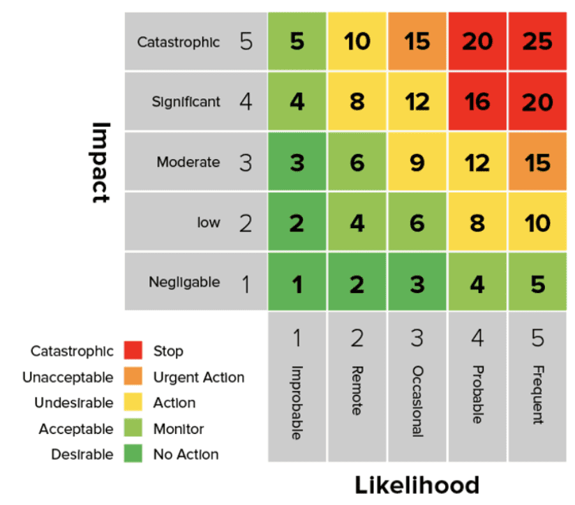
A Risk Heat Map (or Risk Heatmap) is a visual tool used in risk management to present cyber risk data in an easily digestible format. It represents individual values in a matrix using color-coded sections to indicate varying levels of risk. By displaying levels of risk based on likelihood and impact, a heat map transforms complex datasets into actionable takeaways.
Unlike traditional charts or tables, Risk Heat Maps provide an intuitive and engaging way to identify, rank, and act on risks. They’re invaluable for organizations seeking to prioritize efforts and systematically reduce vulnerabilities.
Why and When Should You Use a Risk Heat Map?
Risk Heat Maps are invaluable tools for simplifying decision-making, especially when large volumes of complex data must be translated into clear, actionable priorities. They are particularly effective in helping organizations focus on what matters most by visually representing risks based on their likelihood and impact.
Here are some key use cases where Risk Heat Maps shine:
- Compliance Audits: Staying compliant with regulations can be overwhelming, but Risk Heat Maps make it easier by instantly highlighting gaps in meeting compliance standards. This helps organizations confidently prepare for audits and ensures they remain aligned with evolving regulatory requirements.
- Incident Response Planning: When faced with cybersecurity threats or unexpected incidents, a Risk Heat Map can guide your response by identifying the risks with the highest potential impact. This allows teams to prioritize actions and allocate resources efficiently, minimizing disruption and damage.
- Resource Allocation: Cybersecurity budgets and resources are often limited, making it critical to allocate them effectively. Risk Heat Maps visualize risk levels across business units, IT assets, or processes, enabling organizations to deploy resources where they are needed strategically.
- Communication with Executives: Understanding risks can be challenging for non-technical stakeholders. Risk Heat Maps serve as an effective tool to communicate risks in a simple, visual way that eliminates technical jargon. This builds trust and understanding and helps executives make informed decisions about risk management strategies.
How Does a Risk Heat Map Work?
At first glance, a Risk Heat Map may look simple, but its true power lies in its ability to visually and systematically present complex information about potential risks. By organizing risks clearly and structured, businesses can make informed decisions and effectively allocate resources to address vulnerabilities.
Axes
Risk Heat Maps are built on two key axes that quantify and categorize risks:
- Horizontal Axis: Represents the likelihood of a cyber event occurring. Based on historical data, system vulnerabilities, and the external threat landscape, this is typically rated on a scale (e.g., low, medium, high). It helps organizations understand how probable a specific risk is.
- Vertical Axis: This represents the potential impact that an event could have on your business. This impact can take many forms, including financial loss, operational disruptions, reputational damage, or regulatory compliance breaches. High-impact risks often represent the greatest threat to a business’s long-term stability.
Color Coding
To make risks easier to interpret at a glance, Risk Heat Maps use a color-coded spectrum to represent the severity of each risk. The colors convey urgency and serve as a call to action:
- Green: Low risk – These risks pose minimal threat and can be monitored over time without immediate action. They are often routine or have negligible consequences.
- Yellow/Orange: Moderate risk – Risks in this category require attention and mitigation planning but may not need immediate intervention. They often include issues that could escalate if left unaddressed.
- Red: High risk – Risks in the red zone are critical and demand urgent action. These are the areas where businesses should focus their resources to prevent significant damage.
Plotting Risks
The next step is plotting individual risks on the map by assessing their likelihood and impact. Each risk is assigned a position within the grid based on these two factors. For instance:
- A server vulnerability that could have a critical impact but is unlikely to be exploited might fall into the orange zone. Monitoring and addressing are important but may not be the highest priority.
- A phishing attack targeting senior executives, with a high likelihood of occurrence and severe potential repercussions, would land squarely in the red zone. This would make it an urgent priority for mitigation efforts.
By visualizing risks, teams can see which areas need the most attention. The Risk Heat Map enables organizations to prioritize their most urgent and impactful risks, ensuring they can respond proactively before issues escalate.
Whether used in cybersecurity, project management, or business continuity planning, this tool provides a clear and actionable snapshot of risk exposure, allowing for better decision-making and strategic planning.
Top 5 Use Cases of a Risk Heat Map
Risk Heat Maps provide a range of transformative benefits for cybersecurity teams and organizations, helping to streamline processes and improve overall security strategies. These benefits include:
1. At-a-Glance Visualization
Risk Heat Maps offer an intuitive way to grasp the most critical risks and vulnerabilities in your organization quickly. Instead of sifting through lengthy reports or endless spreadsheets, teams get a clear, color-coded overview of the most pressing threats, making it easier to prioritize and act swiftly.
2. Resource Allocation
Risk Heat Maps enable organizations to allocate resources more effectively by pinpointing areas of highest risk. Funds, time, and personnel can be directed to where they’ll have the most significant impact, improving efficiency and helping to maximize cost-effectiveness, particularly for organizations with limited budgets.
3. Improved Communication
These visual tools act as a bridge between technical teams and executives, translating complex cybersecurity data into a format that’s easy to understand. This ensures that decision-makers can grasp the severity of key issues and make informed decisions about the next steps, fostering better alignment across the organization.
4. Enhanced Proactivity
Risk Heat Maps empower teams to stay ahead of potential threats. Organizations can adopt a proactive security posture by identifying risks before they escalate into major incidents. This helps minimize damage and improves overall preparedness for future challenges, ensuring a stronger and more resilient security framework.
How to Build a Risk Heat Map
Creating an actionable Risk Heat Map may seem complex but simpler than you think. Follow these five detailed steps to get started:
Identify Key Assets
Begin by compiling a comprehensive list of your organization’s critical IT and business assets. These could include servers, databases, applications, data repositories, employee accounts, and other elements vital to your operations. The goal is to pinpoint everything that could be a target or at risk in case of a security or operational incident.
Define Risk Metrics
Establish clear criteria for assessing the likelihood and impact of risks affecting your assets. Standard metrics include financial losses, reputational damage, operational downtime, and regulatory liabilities. Defining these metrics ensures a consistent approach when evaluating risks and helps stakeholders understand the potential consequences.
Collect Accurate Data
To ensure your Risk Heat Map reflects real-world scenarios, collect data from reliable sources such as vulnerability scans, penetration tests, audit results, and threat intelligence reports. This information should be as comprehensive and up-to-date as possible, highlighting technical vulnerabilities and broader organizational risks. Inaccurate or outdated data could lead to blind spots and poor decision-making.
Visualize and Map Risks
Once you have your data, use a 5×5 grid matrix to plot risks based on their likelihood and impact. Assign a color-coded system (e.g., red for high risk, yellow for moderate risk, green for low risk) to make the map intuitive and easy to interpret. Visualizing risks in this way helps decision-makers prioritize mitigation efforts and allocate resources effectively.
Calculate Your Risk
To calculate risk for a heatmap, multiply the likelihood of an event occurring by its impact if it does happen. This basic formula, Risk = Likelihood × Impact, helps prioritize which risks need the most attention based on their potential severity and probability.

Impact (Business Criticality): Impact refers to the potential consequences a risk event could have on the business. This includes financial loss, operational disruption, reputational damage, or regulatory penalties. The more critical the affected systems or data, the higher the impact.
Likelihood: Likelihood measures the probability that a risk event will occur. It considers factors like existing vulnerabilities, threat activity, and the effectiveness of current security controls. A higher likelihood means the risk is more probable.
Update Regularly
Risks are not static—they evolve as your organization grows and new threats emerge. Regularly update your Risk Heat Map with data gathered from ongoing vulnerability assessments, threat evaluations, and incident reports. This ensures your map remains a reliable and actionable tool for proactive risk management and keeps your organization prepared for potential challenges.
Following these steps, you’ll create a dynamic and practical Risk Heat Map that helps your team identify, prioritize, and mitigate risks effectively.
Tips for Maximizing the Effectiveness of Your Risk Heat Map
- Focus on Data Accuracy: Ensure the input data is relevant and reliable to avoid misalignment.
- Align with Goals: Tailor your risk categories to your organization’s unique risk tolerance and business objectives.
- Automate Updates: Use tools or software to refresh your map with real-time changes automatically.
- Use Frameworks: Incorporate risk prioritization frameworks like FAIR (Factor Analysis of Information Risk) for enriched insights.
The Benefits of Risk Heat Maps in Cybersecurity
Risk Heat Maps offer several transformative benefits for cybersecurity teams and organizations, including:
At-a-Glance Visualization
Risk Heat Maps offer an intuitive way to grasp the most critical risks and vulnerabilities in your organization quickly. Instead of sifting through lengthy reports or endless spreadsheets, teams get a clear, color-coded overview of where the most pressing threats lie, making it easier to prioritize and act swiftly.
Resource Allocation
Risk Heat Maps enable organizations to allocate resources more effectively by pinpointing areas of highest risk. Funds, time, and personnel can be directed to where they’ll have the most significant impact, improving efficiency and helping to maximize cost-effectiveness, particularly for organizations with limited budgets.
Improved Communication
These visual tools act as a bridge between technical teams and executives, translating complex cybersecurity data into a format that’s easy to understand. This ensures that decision-makers can grasp the severity of key issues and make informed decisions about next steps, fostering better alignment across the organization.
Enhanced Proactivity
Risk Heat Maps empower teams to stay ahead of potential threats. Organizations can adopt a proactive security posture by identifying risks before they escalate into major incidents. This helps minimize damage and improves overall preparedness for future challenges, ensuring a stronger and more resilient security framework.
Advanced Tools to Enhance Your Risk Heat Map
Modern technologies like AI and automation are transforming how Risk Heat Maps are built and maintained. Platforms like Balbix automatically map and update risk using real-time data, delivering dynamic insights that support faster, more informed decisions.
Frequently Asked Questions
- What is a Risk Heat Map in Cybersecurity?
-
A Risk Heat Map is a visual tool that categorizes cybersecurity risks based on their likelihood and impact using a color-coded grid. It helps organizations prioritize threats, allocate resources efficiently, and make informed risk management decisions.
- How Do You Create a Risk Heat Map?
-
To create a Risk Heat Map, follow these steps:
- Identify key assets and risks.
- Define risk assessment criteria (likelihood and impact).
- Collect and analyze risk data.
- Plot risks on a color-coded matrix.
- Regularly update the heat map to reflect evolving threats.
- Why Are Risk Heat Maps Important for Cybersecurity?
-
Risk Heat Maps simplify complex data, making it easier for security teams to identify and prioritize high-risk vulnerabilities. They improve resource allocation, enhance communication with executives, and support proactive risk mitigation strategies.
- What Are the Key Components of a Risk Heat Map?
-
A Risk Heat Map consists of:
- Likelihood Axis: Measures how probable a risk event is.
- Impact Axis: Assesses the potential consequences of a risk.
- Color Coding: Green (low risk), Yellow/Orange (moderate risk), and Red (high risk) to indicate severity.
- How Often Should a Risk Heat Map Be Updated?
-
A Risk Heat Map should be updated regularly—at least quarterly or whenever significant changes in the threat landscape, compliance requirements, or IT infrastructure exist. Continuous updates ensure it remains an accurate and actionable cybersecurity tool.